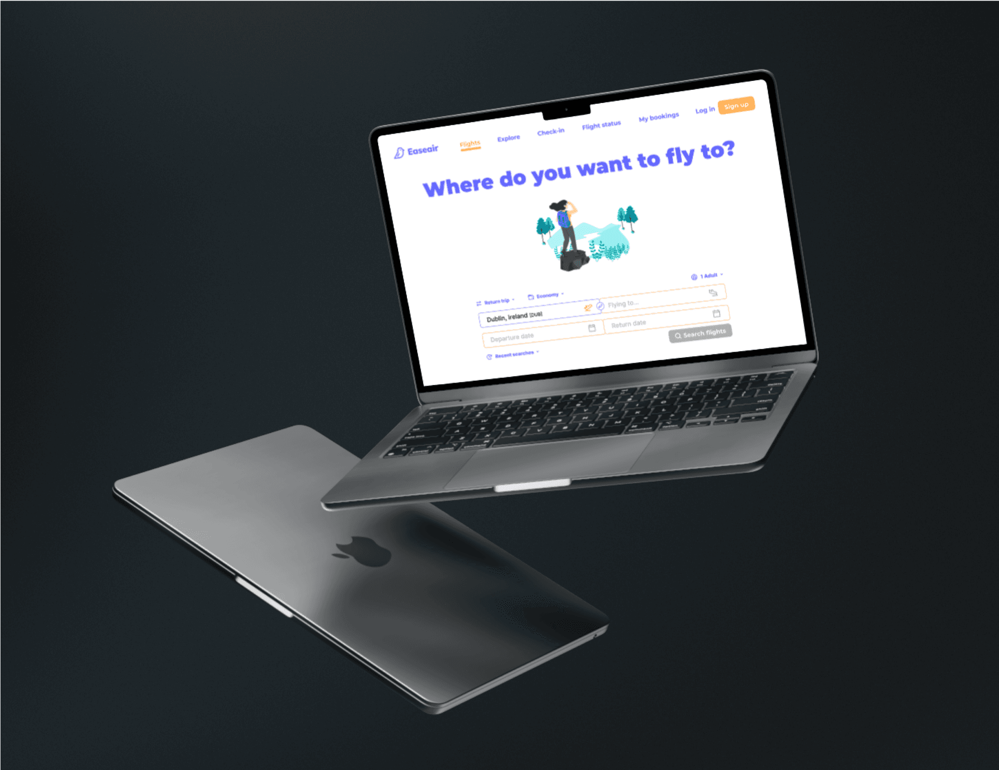
Easeair
Booking a flight is quite straightforward you'd probably think. Well, not so much it turns out. As part of my Professional Diploma in UX Design, we had to design the flight search & booking process from scratch. A multitude of tiny details & considerations to include

I'll never look at booking a flight the same way ever again
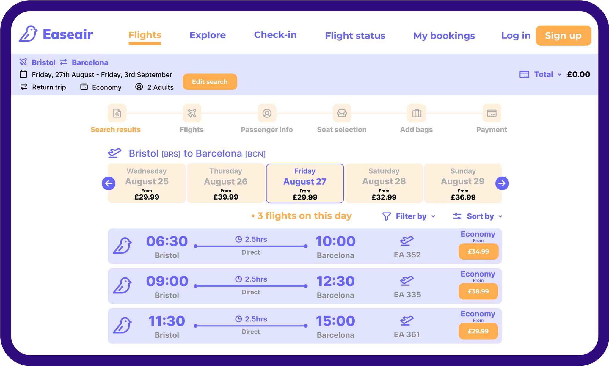
What feels like a routine, almost mundane task to many actually incorporates much complexity and nuance. Deconstructing this booking took a lot of research, competitive benchmarking, customer journey mapping, and trial & error. Trying to identify best practice across the industry and to leave out parts of the process that increase friction or confusion, in order to take the user on a seamless a journey as I could.
Easeair is my attempt at streamlining the flight booking experience in a minimalist & aesthetically-pleasing interface
The number of subtleties involved, from currency changes to auto-find & fill- flight booking is an ideal example of how important it is to place the user directly in the centre of the experience. One can see how people might drop off the booking process, if it becomes too clunky or if they get frustrated from not being able to complete a task. Although, for someone who calls themselves a 'climate-aligned designer', making it easier to book flights isn't quite aligned with that value. However, this was the mandatory project for the course and it serves as a useful template for other digital user journeys from which much can be gleaned.
